


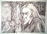
Just a quick spur of the moment post here to run this by you.... I'm toying with the idea of updating my blog header, so I am trying this one out of the Ravens I painted recently... What do you think?
It changes the feel of things quite a lot and the blog's identity I think, so the question is to those of you who know me and my blog quite well by now... does the old header portray me and my work better? Should I leave well alone or is it time for a change?
I'd love to know what you think!
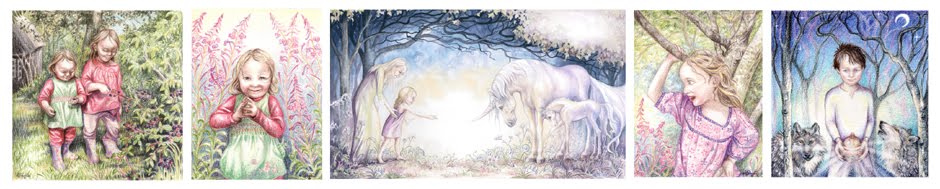
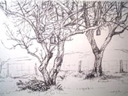
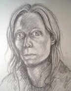
Here's the old one...
 See you soon...

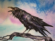


Beautiful as your painting is, I think the ravens give a "darker" feel which is somewhat contrary to your "brightness" and might give people a false impression. The sense I get from your blog is more like the girl riding the unicorn. You might add a pair of ravens flying between the trees of your former masthead . . . ?
ReplyDeleteThey're both wonderful... but I can see how challenging the decision is. The old header has an illuminated manuscript feel, I love the page heading feel, the crows are more painterly. I absolutely LOVE the crow painting - love the salt technique here, the sky is so cool, but I think I love the old header as it really fits the writing/painting theme and has that beautiful arch. But I;d also love to see the crows somewhere prominent, too! How's that for a Libra answer!!
ReplyDeleteI must confess, whilst I love 'The Ravens' I think I'd probably vote for the original - there's something comforting in familiarity I think.....or maybe I'm just getting old!
ReplyDeleteOh, I really like WOL's idea of the ravens in the first header.. !
ReplyDeleteHow about using the original, but occasionally changing the central image below the title arc?
ReplyDeleteThe ravens artwork could be dropped into the arc area with Photoshop quite easily... or any other image in just the same way. Maybe that would allow you to keep the same feel but vary the header content a little to go with your mood, or change with the seasons!
There... another option to consider!
Best wishes for the new year.
They are both beautiful, and your ravens are gorgeous (one of my favourite birds), but I think I'd also give my vote to the original - I'm too much enamoured of your skeletal trees and celtic birds.
ReplyDeleteBest wishes for the new year!
Thanks folks! My feelings are with yours it seems... I'm not that hot with photoshop but I love the idea of putting the Ravens into the original so have had a go! See what you think!
ReplyDeleteI personally love the way the ravens work within the old header banner.
ReplyDeleteWell done for putting the idea to work through Photoshop. With practise, you should be able to create a template that you could drop new artwork behind, to allow you to change the main image at will. Overlaying an image to break borders knits it all together beautifully.
And you could lift those ravens, and explore different background washes too!
I prefer traditional materials, but I am discovering that Photoshop can be a friend too.